
Hue Knows: The Psychology of Color in Branding


On Wednesdays, We Wear Pink... and Successful Brands Wear Their True Colors!
Remember that iconic scene in Mean Girls where the Plastics declare their pink-on-Wednesday rule? Well, they were onto something! Just like how wearing pink was their power move, successful brands know that choosing the right colors is like picking the perfect outfit for a first date—it can make or break that crucial first impression!
Think about it: Colors are basically your brand's outfit, mood ring, and secret weapon all rolled into one. They can make people feel things (hello, psychology!), tell your brand's story without saying a word, and even convince someone to smash that 'Buy Now' button. Pretty powerful stuff for something we learned about while coloring cookie icing as kids, right?
Ready to unleash your brand's true colors? Grab your metaphorical color wheel (and maybe some candy), because we're about to spill the tea on everything from color psychology to cultural meanings, and how to make your brand pop like Regina George on a Wednesday!
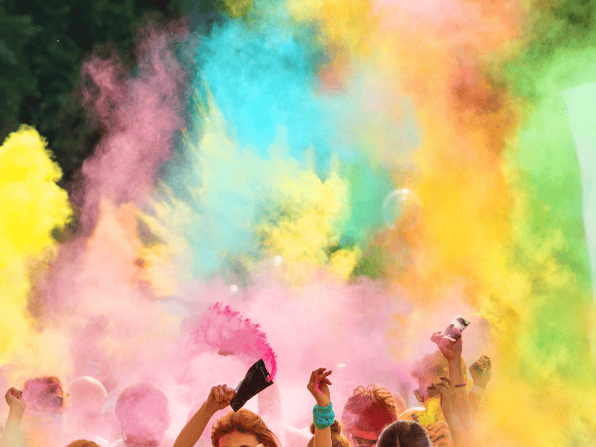
Understanding the Psychology of Color: How Hue Affects Mood
Remember those days when we'd color cookie icing with our moms? Little did we know, we were actually learning about color theory! Those simple food coloring bottles held the secret to creating a rainbow of hues.
Those primary colors—red, yellow, and blue—are like the superheroes of the color world. You can't create them by mixing other colors, but mix these powerhouses together? Magic happens! You get secondary colors like green, orange, and purple. And when you get really fancy and mix a primary color with a secondary color, you get what we call tertiary colors.
Now that we've got the basics down, let's dive into the fun part—the psychology of color and how it can spice up your brand!
Color Meanings:
Red: The Fiery Hue
Red, a color associated with passion, energy, and danger, can evoke strong emotions. In branding, it’s often used to grab attention, stimulate appetite, and convey a sense of urgency. However, overuse can lead to aggression and anxiety.
Yellow: The Sunny Side Up
Yellow, the color of sunshine and optimism, can evoke feelings of joy, happiness, and warmth. It’s often used to draw attention and stimulate mental activity. However, excessive use can lead to feelings of frustration and impatience.
Blue: The Serene Shade
Blue, a calming and soothing color, is often associated with trust, reliability, and security. It’s widely used in corporate branding to convey professionalism and stability. However, too much blue can lead to feelings of coldness and indifference.
Orange: The Energetic Hue
Red + Yellow = Orange, a vibrant and energetic color, can evoke feelings of enthusiasm, creativity, and excitement. It’s often used to stimulate appetite and encourage action. However, excessive use can lead to feelings of aggression and impulsiveness.
Green: The Harmonious Hue
Blue + Yellow = Green, the color of nature and growth, can evoke feelings of peace, harmony, and renewal. It’s often used to convey health, freshness, and environmental consciousness. However, too much green can lead to feelings of boredom and stagnation.
Purple: The Royal Hue
Red + Blue = Purple, a luxurious and mysterious color, is often associated with royalty, wisdom, and spirituality. It’s used to convey elegance, sophistication, and creativity. However, excessive use can lead to feelings of arrogance and superiority.
Pink: The Sweet and Sassy Hue
Red + White = Pink, a a soft and feminine color, often associated with sweetness, innocence, and compassion. It's used to convey gentleness, warmth, and love. However, excessive use can lead to feelings of naivety and childishness.
Black: The Dark Knight
Black, a powerful and mysterious color, often associated with elegance, sophistication, and power. It can also be used to convey a sense of mystery, danger, and formality. However, excessive use of black can lead to feelings of sadness, depression, and negativity.
White: The Pure and Innocent
White, a pure and innocent color, often associated with peace, purity, and simplicity. It can also be used to convey cleanliness, clarity, and modernity. However, excessive use of white can lead to a sterile and cold impression.
Gray: The Neutral Ground
Gray is a neutral color, often associated with balance, stability, and formality. It can be used to create a sense of calm, sophistication, and timelessness. However, excessive use of gray can lead to a dull and boring impression.
Brown: The Earthy Tone
Brown is a warm and earthy color, often associated with nature, stability, and comfort. It can be used to convey a sense of reliability, authenticity, and tradition. However, excessive use of brown can lead to a dull and boring impression.

Color Personality Party: Where Every Shade Has a Mood!
Ever notice how certain brands just *feel* different? It's not just their logo or their fancy marketing—it's their colors doing some serious heavy lifting behind the scenes! Let's break down how different brands use colors to tell their story.
If your brand were at a party, what kind of personality would it have? Let's play matchmaker with colors and brand personalities!
The Life of the Party: Bold & Energetic Brands
Picture that friend who always brings the energy—that's what red, orange, and yellow do for brands! These colors are like a double shot of espresso for your brand identity. Red screams "Hey, look at me!" (think Netflix), while orange brings that friendly, playful vibe (think Fanta). Yellow? It's basically sunshine in color form, bringing optimism and creativity to the table (hello, McDonald's golden arches!).
The Zen Master: Calm & Serene Brands
Then there's your chill friend who always knows how to help everyone relax. That's where blues, greens, and soft pastels come in. Blue is like a warm hug of trust and reliability (think LinkedIn or Facebook), while green whispers tales of growth and harmony (whole foods, anyone?). Pastels? They're like the gentle background music that makes everyone feel at ease—perfect for wellness and beauty brands.
The Sophisticated Socialite: Luxurious Brands
Finally, we've got the fancy friend who makes everything look effortlessly elegant. Purple, gold, and black are the power trio of luxury. Purple has been screaming "royal vibes" since forever (Crown Royal knows what's up), while gold adds that touch of prestige. And black? It's the little black dress of the color world—timeless, sophisticated, and always in style (just ask Chanel).
The real magic happens when you understand your brand's personality and match it with colors that tell your story. It's like finding the perfect outfit that makes you feel like a million bucks—when you get it right, everything just clicks!
Want to know the best part? You don't have to stick to just one color personality. Just like you're not always in party mode or zen mode, your brand can mix and match these vibes to create something uniquely you.

Colors Without Borders: A Passport to Global Meanings
Just when you thought you had this color thing figured out, here's a fun plot twist—colors are basically world travelers with different personas in every country they visit! What works in one culture might raise eyebrows (or worse) in another.
Let's take this colorful journey around the world!
White: The Ultimate Cultural Chameleon
In Western cultures, we're all about white at weddings, symbolizing purity and new beginnings. But plot twist—in many Eastern cultures, particularly in China and parts of India, white is traditionally worn at funerals. Talk about a fashion faux pas waiting to happen!
Red: The Color of Many Faces
Here's a fun one: While red might scream "Stop!" or "Valentine's Day!" in Western countries, in China it's basically the equivalent of a lucky charm on steroids. It represents good fortune and prosperity—which is why you'll see it everywhere during Chinese New Year. Meanwhile, in South Africa, red is the color of mourning. Who knew one color could be so complex?
Purple: From Royalty to... More Royalty?
Here's one of the few colors that mostly keeps its story straight around the world. Pretty much everywhere you go, purple's got that royal, luxury vibe. Why? Because back in the day, purple dye was super expensive to make, so only the rich and royal could afford it. Talk about a lasting impression!
Making It Work: The Art of Color Adaptation
So what's a brand to do in our globally connected world?
1. Do Your Homework
Before you splash that perfect shade of [insert color] all over your international marketing campaign, maybe Google it first? It's like checking the weather before picking out your outfit for the day—basic survival skills!
2. Consider Regional Variations
Sometimes you don't need to completely overhaul your brand colors—just tweak them for different markets. Think of it like offering different spice levels at a restaurant. Same dish, different kick!
3. Test Before You Invest
When in doubt, ask! Running your color choices by locals or cultural consultants is like having a friend check if there's spinach in your teeth before a big presentation—always appreciated!
The Secret Sauce? …Flexibility!
The most successful global brands know how to dance between cultural color meanings while keeping their core identity intact. It's like being fluent in multiple languages—you're still you, just expressing yourself differently depending on who you're talking to! (#goals)
Want to make your brand colors work across cultures? The key is finding that sweet spot between staying true to your brand personality and respecting cultural nuances. It's not about playing it safe—it's about playing it smart!
The Rainbow Road to ROI: Where Colors Convert!
Ever wonder why you can't resist clicking that big orange "Buy Now" button? Or why certain products practically jump off the shelf into your shopping cart? Let's peek behind the marketing curtain and see how colors are secretly influencing our decisions!
Click Me, Maybe?: The Psychology of CTA Colors
Think of your call-to-action button as asking someone on a date—you want to stand out, but not come on too strong! Orange and green buttons often get the most clicks (hello, conversion rates!), but here's the real tea: it's all about contrast. That gorgeous blue button might look designer-chic, but if it's swimming in a sea of blue design elements, it's basically playing hide and seek with your visitors.
Pro tip: Try this quick test—squint at your screen. Can you still see your CTA button? If not, it's time for a color makeover!
Shelf Appeal: Making Products Pop
Ever notice how certain products seem to shout "Pick me!" from the shelf? That's color psychology doing its thing!
Take food packaging—warm colors like red and yellow make us think "yum!" (McDonald's wasn't playing around with those golden arches). Meanwhile, spa products rock those cool blues and greens because nothing says "relax" like ocean vibes.
Fun fact: Studies show we make up our minds about a product within 90 seconds of seeing it, and up to 90% of that decision is based on color alone. Talk about judging a book by its cover!
Website Wonderland: Painting the Digital Canvas
Your website is like your brand's digital outfit—it needs to look good AND feel right! Here's how to dress for success:
The 60-30-10 Rule:
(Think of it like putting together an outfit.. once you know the weather, of course:)
60% is your main color (like your favorite jeans)
30% is your secondary color (that perfect top)
10% is your accent color (those killer accessories)
Balance is key—nobody wants to look at a website that feels like a rainbow exploded! Unless you're selling rainbow explosions, in which case, carry on!
The Hidden Gem to Color Success
The real magic happens when all these elements work together. Your CTA buttons, product packaging, and website design should be like a well-choreographed dance—each element knowing its part while working together to create something amazing.
Remember: The best color choices aren't just pretty—they're strategic. They guide eyes, warm hearts, and yes, open wallets!
Want to know if your color game is on point? Here's a quick test: Does your website make people feel the way your brand makes them feel? If your brand is all about zen vibes but your website colors are screaming "party time," something's gotta give!

So Fetch! Your Color Journey Ends Here... For Now! 🌈
Well, look at you now! From understanding why Regina George wore pink on Wednesdays to becoming a total color psychology queen bee, you're ready to make your brand the next big thing—no Burn Book needed!
Let's recap our greatest hits:
(or should I say, our most Instagram-worthy moments?):
Colors are your brand's personality in visual form—choose them wisely, and they'll do the talking for you
What works for one audience might totally bomb with another (just like Regina's rules didn't work at North Shore High!)
Strategic color choices can transform your website from "meh" to "fetch" faster than you can say "Get in loser, we're going shopping!"
Your brand's color palette is like your signature look—make it iconic!
⚠️ Before You Start Your Color Revolution...
Here's the inside scoop (and these rules are actually a thing):
⌵ Make It Make Sense
Your target audience is your plastic crew—pick colors that speak their language! Are they bold statement-makers who'd rock a bright red? Or more like the art freaks who vibe with earthy tones?
⌵ Trust the Process, Not Just Your Gut
Even Regina George did her research (sort of). A/B test those color combinations like you're planning the perfect Spring Fling decoration scheme. Let the data be your Ms. Norbury—honest, reliable, and sometimes surprisingly insightful!
⌵ Stick to Your Colors
Once you've found your signature palette, own it! Consistency in branding is like having a reliable routine—it builds trust faster than a three-way calling attack builds drama.
Choosing your brand colors isn't about following the latest trends or picking whatever's so hot right now. It's about telling your brand's unique story in living color. Whether you're going full Regina George pink or keeping it cool like Janis Ian black, let your brand's true personality shine through.
Now go forth and make your brand so fetch! (Yes, we're making fetch happen!) Your perfect color palette is out there, waiting to help your brand sit at the cool table.
Need more color inspiration? Keep this guide in your back pocket like a trusty Burn Book—minus the burn, plus all the brand-building brilliance!
The limit for your brand's potential? It doesn't exist! 💫